Client
- Personal work
My Services
- Logo and Brand
The mission
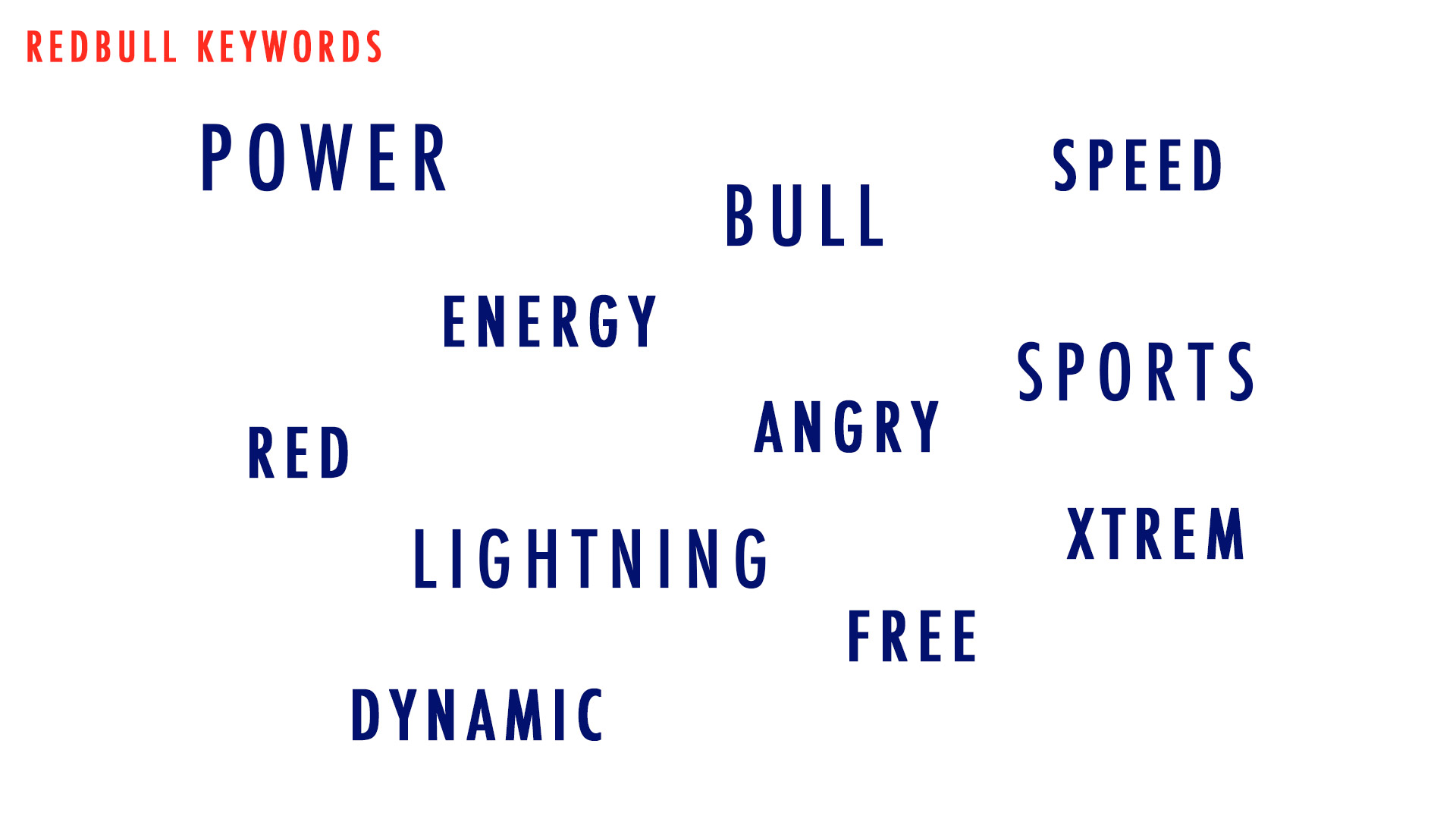
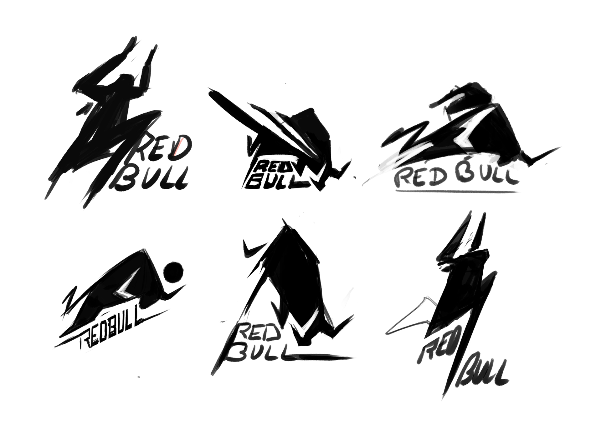
Now I have my keywords, I begin to sketch some ideas with different shapes, fonts and focused on dynamic and energy. The bull and lightning are huge symbol for me for the brand.
Two ideas were interesting and I wanted to explore it. The first one had a great dynamic but the bull was not clear enough and the cercle didn’t mean anything for me and didn’t match with my keywords.
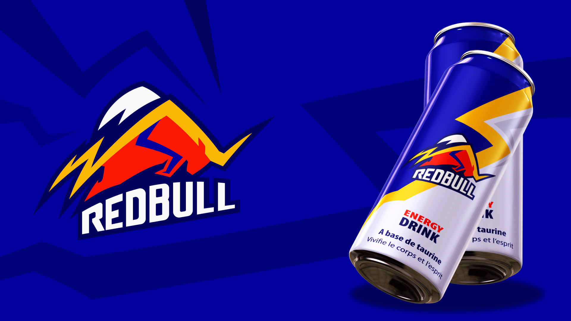
I pushed more the design with wings and the lightning shape combined with the bull shape. I worked on the bull shape to make it more visible and I sharped the edges.
The colors used were the colors of the actual logo of Redbull. I add a darker blue to make all the others colors pop. The researches are finished and now it’s time to vectorize the logo.


